A Design Facelift:
Transforming Old Designs with the New Design System
What to look for?
001
How did I apply the new design system, make designs responsive, and effectively deliver to the dev team?
Project Info
002
Timeline
2 weeks
Role
UX Designer
Team
Individual Project
Overview
003
New design system ready to shine
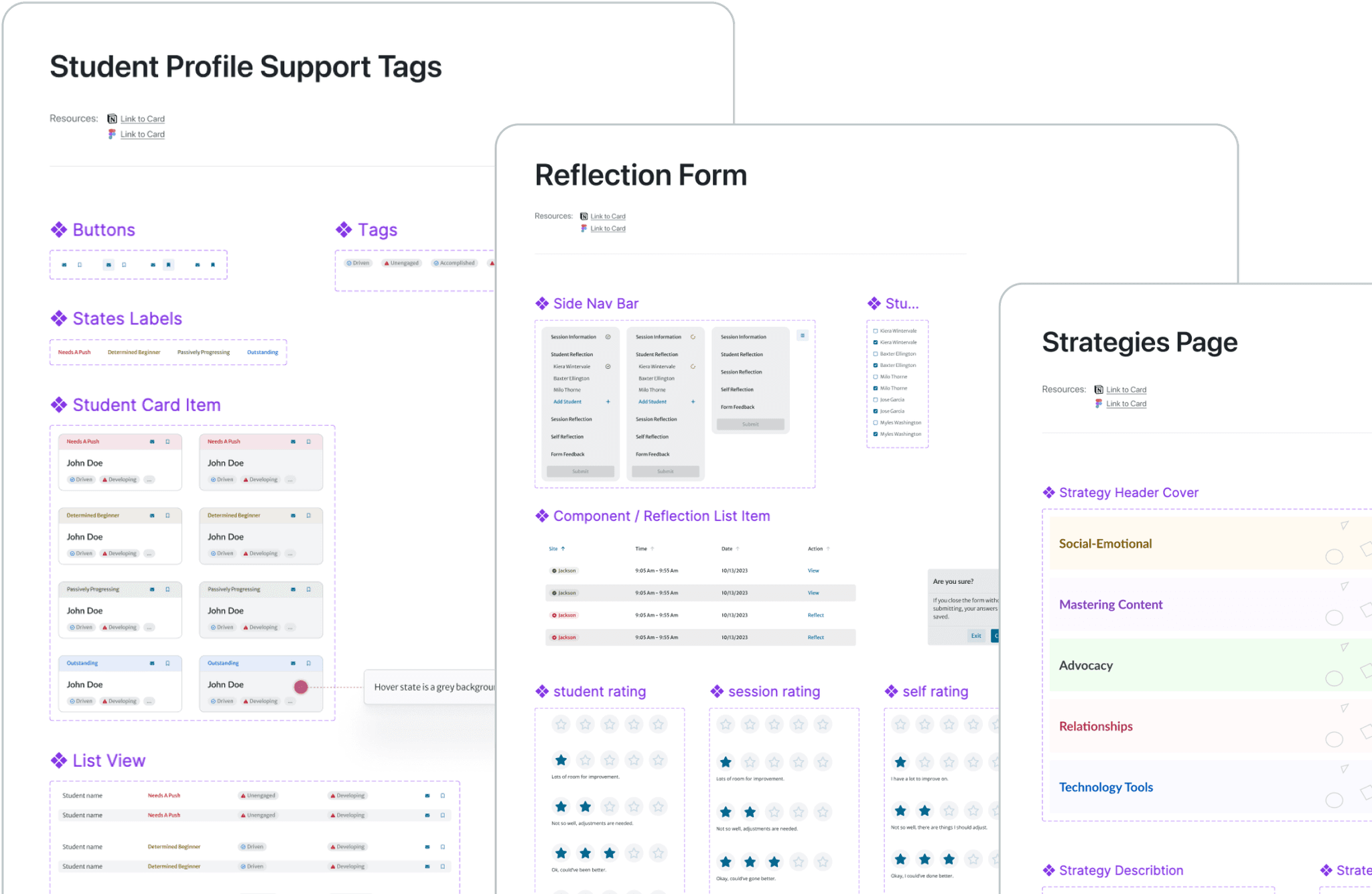
PLUS design system team revamped the entire design system and each designer was tasked with updating specific frames using the new system, ensuring responsiveness of each frame, and hand off to developers for implementation.
Snapshot of the new design system
Facelift
005
Curate components
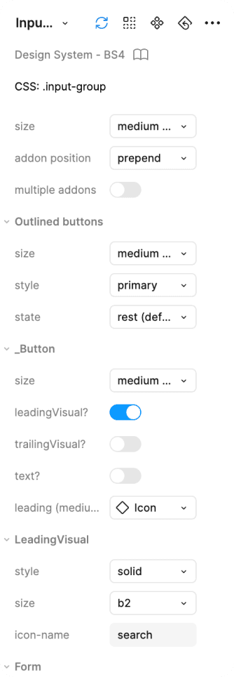
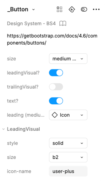
Firstly, I chose the correct components from the design system, adjusted their variables according to the documentation and the specific content of this page.
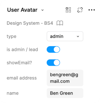
Variables of components (left) and an example of components (right)
Mind the gaps
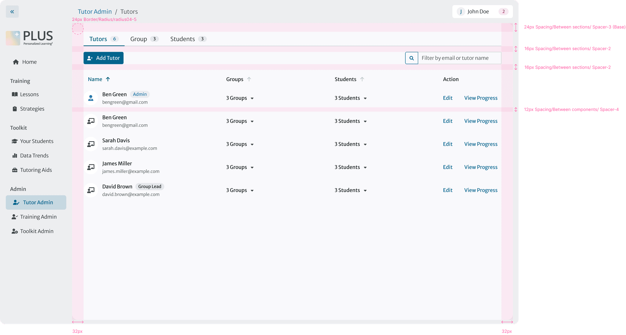
Then I ensured all the paddings between components are adjusted to the new design guidelines.
Finding the corresponding padding variables and applying them
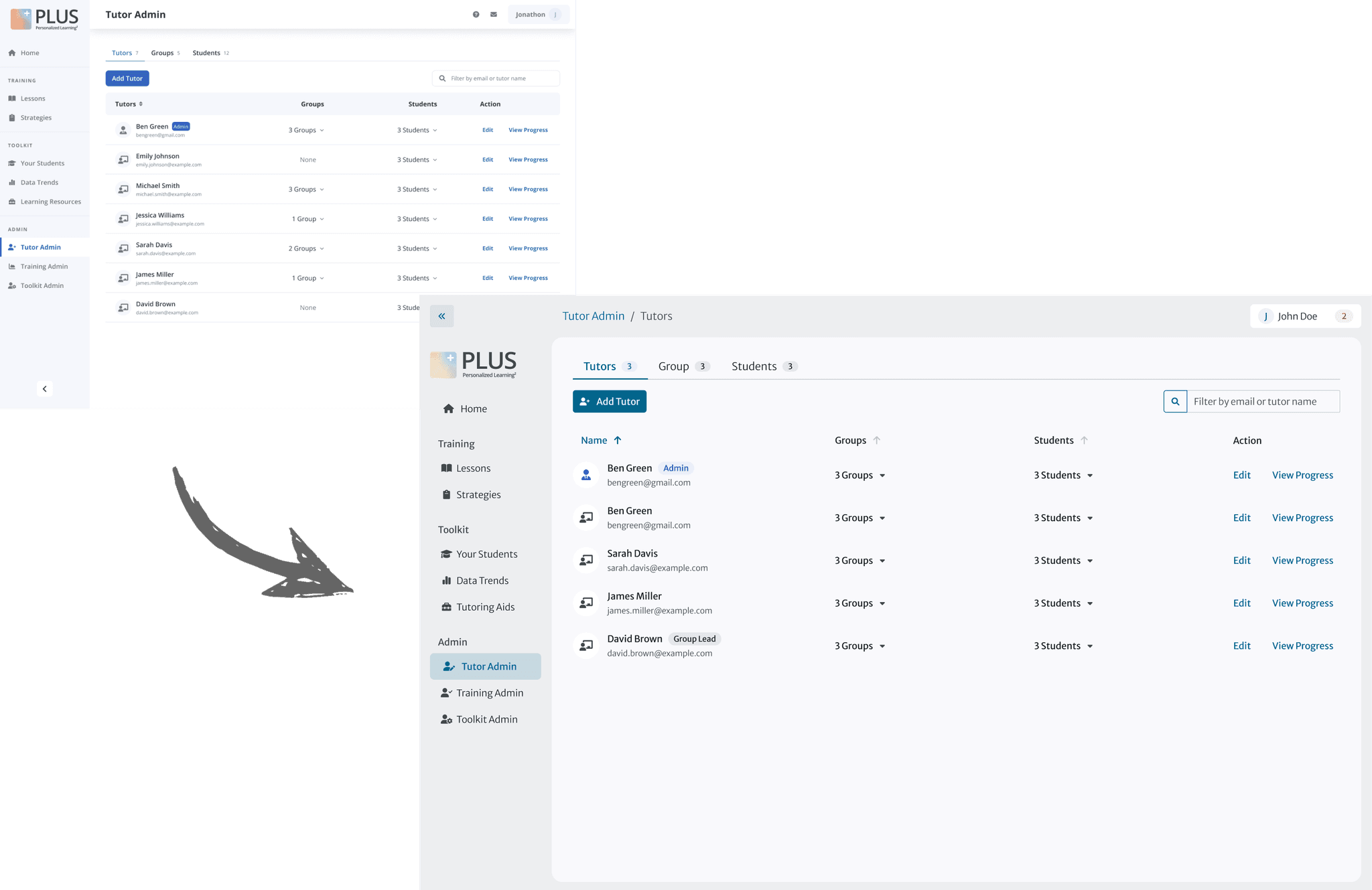
Witness the transformation
Before vs. After facelift
Responsiveness
006
Responsive is also strategic!
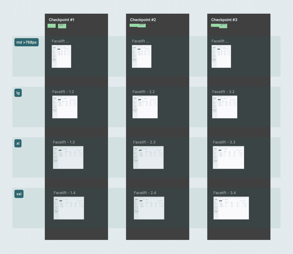
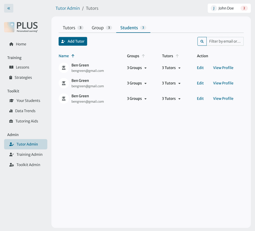
I followed the internal guidelines for responsive design, which is a 3-step checker than ensures all frames are adaptable across various screen sizes and breakpoints.
One challenge I faced was that some components in the design system weren’t optimized for smaller screens. To address this, I made strategic decisions to hide unimportant columns and implement horizontal scrolling when necessary.
3-step checker that ensures frames are responsive in all circumstances
Using variants to ensuring the screen is responsive at different break points
Remove column "Math Software" at width 992px
Enable horizontal scrolling at width 1200px
Handoff
007
Seamless delivery
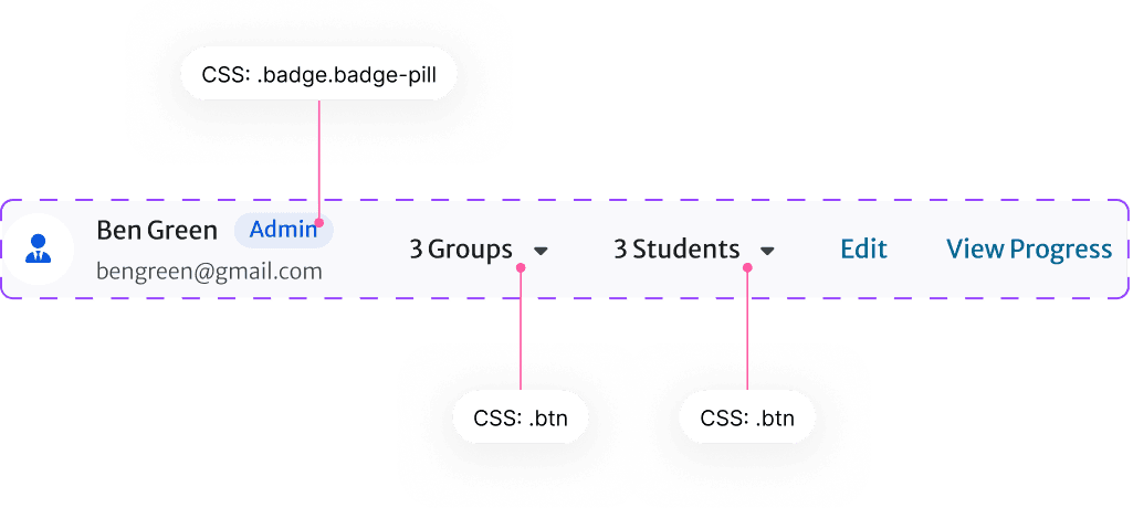
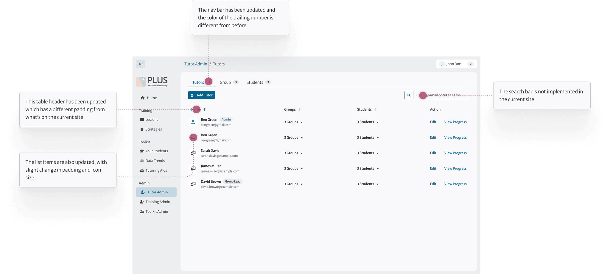
I wrote clear and concise notes for developer using our internal tooltip to point out where and what changes have been made.
